What are you waiting for?
Let's talk
+880-1307-636-476
hello@techsuf.com
+880-1307-636-476
Techsufh
techsuf

Sep 07 2024
45
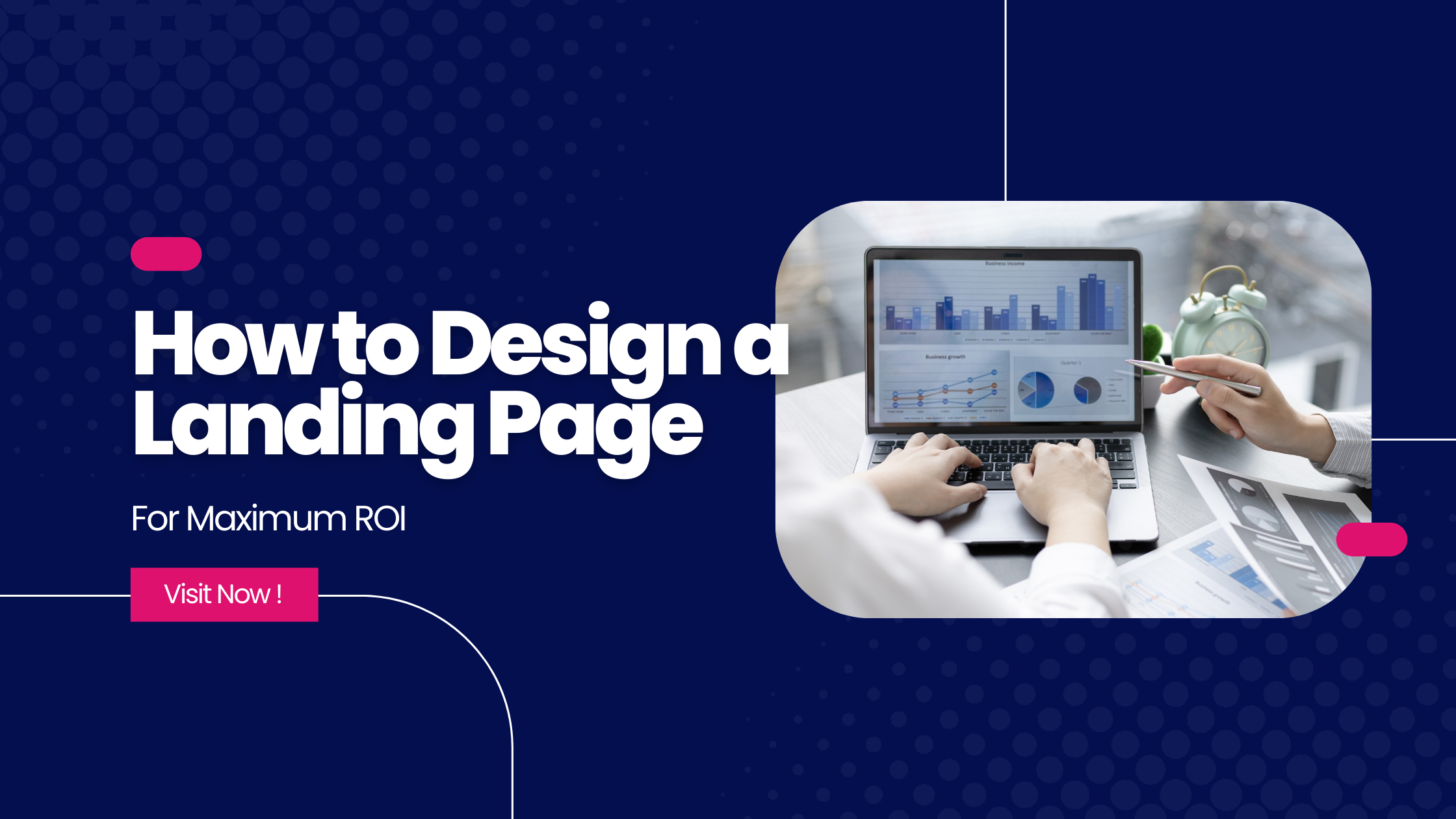
Learn the process of how to design a landing page with writing, and testing landing pages that effectively turn visitors into leads.
Landing pages are the digital storefronts of the internet. They’re specifically designed to capture visitors the moment they click an ad, submit a form, or arrive from a search engine. Unlike a bustling homepage, a landing page is a focused, single-purpose webpage optimized to convert visitors into leads or customers.
● What is a Landing Page?
● How to Create a High-Converting Landing Page
● Why Your Business Needs a Landing Page
● Landing Page Best Practices for Success
● Design Landing Pages for Conversions
● Landing Page Copywriting Tips for Impact
● A/B Testing Your Landing Page for Optimization
● Key Landing Page Metrics to Track
● Improve Landing Page Performance with These Tips
● Nurturing Leads After Conversion: A Guide
Landing pages are special web pages designed to convert visitors into customers. The main goal of a landing page is to get more leads. To do this, landing pages often have a lead form where people can share their contact information. In exchange for their details, visitors get something valuable like an ebook or free trial.
Creating a high-converting landing page doesn’t have to be complex. With the right steps, you can design a page that effectively captures leads. Let’s break down the process into easy-to-follow steps.
Before you start building your landing page, it’s important to know what you want to achieve. What’s your goal? Are you trying to sell a product, collect email addresses, or something else?
Next, figure out who you’re trying to reach. Understanding your target audience helps you create content and offers that appeal to them.
For example, if you’re launching a new book, your goal might be to build an email list of potential readers. Your target audience would be people interested in your book’s genre.
To get people to sign up, offer something valuable like a free chapter or a reading guide. This is called a lead magnet.
Focus on one goal per landing page. This helps keep things simple and effective.
Let’s move on to building the perfect landing page.
Once you know your target audience and what you want to achieve, it’s time to choose a platform to build your landing page. There are many options out there!
You can use popular website builders like WordPress or Wix, or specialized landing page tools like Unbounce or Leadpages. While these tools can be great, they often come with a price tag. If you’re just starting out, you might find them a bit expensive.
A good alternative is Techsuf’s theme store. Choose your favourite one and contact us. We’ll make sure you get your website spending less.
Now it’s time to make your landing page look amazing! Even if you’re using a template, you can customize it to match your brand.
Focus on these key elements:
Now it’s time to add some powerful words to your landing page. The right copy can make all the difference.
A typical landing page includes:
Your copy should be clear, concise, and focused on benefits. Use words like “you” and “your” to connect with visitors.
Want to save time? Try using AI to create a first draft of your copy. Then, add your personal touch to make it perfect.
After you’ve convinced visitors that your product or service is amazing, it’s time to tell them what to do next. This is where your call to action (CTA) comes in.
Your CTA is like a big, shiny button that tells people to take the next step. It should stand out and be easy to see.
Use strong action verbs like “download,” “submit,” or “get started” to tell people exactly what to do.
We’ll talk more about creating effective CTAs in the next section.
Sometimes, you need to collect information from your visitors. This is where a form comes in handy.
Focus on what you really need. Ask for only the essential details, like name and email. Avoid asking for too much information, as this can scare people away.
According to a recent survey, most marketers agree that four questions is the ideal number for a landing page form. In fact, many successful forms only ask for name and email.
Once you’ve collected leads, make sure to use email marketing and CRM tools to stay in touch with your new contacts.
You’re almost there! Before you hit the “publish” button, it’s important to double-check everything.
Once you’re confident that everything is in order, you can launch your landing page and start generating leads!
Your work isn’t finished after you hit publish. The best landing pages are always being tested and improved.
A/B testing is a great way to see what works best. Try changing things like:
By analyzing your results and user feedback, you can keep making your landing page better and better.
Remember, improvement is an ongoing process. Keep testing and refining your landing page for optimal results.
Landing pages are special web pages designed to convert visitors into customers. Unlike your homepage, which has lots of information, a landing page focuses on one thing: getting people to take action.
Why not just use your homepage? Because landing pages eliminate distractions. They keep visitors focused on your offer, making it more likely they’ll sign up or buy.
Landing pages work. Our research shows that the average landing page converts around 6% of visitors. That might not sound like a lot, but it’s better than nothing! Most businesses use landing pages to get more leads, while others focus on sales.
Creating a great landing page is about more than just looks. Here are some key things to remember:
Let’s dive deeper into each of these tips.
Would you like to start with headlines?
Your headline is your landing page’s first impression. People have short attention spans, so make it count. Clearly and quickly communicate the value you offer.
Imagine someone stumbling upon your landing page. They’ve got seconds to decide if they’ll stick around or bounce. Your headline is their first clue about what you’re offering. So, make it compelling and to the point.
A picture is worth a thousand words. Your image should evoke the feeling your offer promises. It’s like a visual promise of what’s to come.
Remember, not all images are created equal. Experiment with different options to see what resonates best with your audience. We’ll talk more about testing later.
Don’t hide your lead form. Place it prominently above the fold. This means visitors can see and access it without scrolling.
Imagine someone lands on your page. They should be able to see the form and understand what to do next immediately.
Bonus tip: Consider using a sticky form that follows the user as they scroll down the page. This keeps the form always in view.
Your offer is the bait that entices visitors to share their information. It should be directly related to your product or service and provide real value to your target audience.
For example, if you sell running shoes, offering a free guide to preventing common running injuries would be a relevant offer.
Remember, a good offer aligns with your overall marketing goals. It’s not just about getting leads; it’s about nurturing them into customers.
Focus on collecting essential information. In most cases, a name and email address are enough to start building a relationship with a new lead.
Remember, the goal is to make it easy for people to sign up. The more fields you add, the more likely people are to abandon your form.
Prioritize quality over quantity. You can always gather more detailed information later in your sales process.
A landing page should be laser-focused on one thing: converting visitors into leads. That means removing any distractions that might pull visitors away from the main goal.
Keep it simple. Eliminate navigation menus, links to other pages, and anything else that competes for your visitor’s attention. The cleaner your landing page, the better your chances of converting.
In today’s digital world, it’s essential to design with mobile devices in mind. A responsive landing page ensures your message reaches everyone, regardless of the device they’re using.
Prioritize mobile experience. Make sure your forms, buttons, and content are easily accessible and readable on smaller screens.
Your landing page should be optimized for both search engines and paid advertising.
Keywords are key. Incorporate your target keywords naturally into your headline, subheadings, and content. This helps search engines understand what your page is about and increases your chances of ranking in search results.
Consistency is crucial. Make sure the keywords you use in your landing page match the keywords in your ad copy and search campaigns. This reinforces your message and improves your overall marketing efforts.
Remember: SEO is an ongoing process. Keep track of your keywords’ performance and adjust your strategy accordingly.
A thank you page is often overlooked, but it’s a crucial part of the conversion process. It’s your chance to:
By creating a thoughtful thank you page, you can enhance the overall user experience and increase the chances of turning a lead into a customer.
Landing page design is a mix of art and science. While creativity and visuals are important, the page’s functionality is what truly drives conversions.
A great landing page focuses on the user. It’s clear, concise, and easy to navigate. By following a proven structure, you can create landing pages that deliver results.
Here’s a basic landing page blueprint:
By combining these elements with a touch of creativity, you can design landing pages that not only look great but also convert visitors into leads.
People don’t read online like they read books. They scan pages quickly, looking for key information. That’s why your landing page layout is so important.
Here’s how to make the most of your design:
By following these guidelines, you can create landing pages that are both visually appealing and highly effective at converting visitors into leads.
Color can significantly impact how visitors perceive your brand and influence their actions. It’s essential to choose colors that align with your brand identity and evoke the desired emotions.
Consistency is key. Use your brand colors throughout your landing page to reinforce brand recognition. However, don’t be afraid to experiment with contrasting colors to draw attention to important elements like your call to action (CTA) button.
Consider the psychology of color:
Remember: These are general associations, and cultural differences can influence color perception.
Your landing page image is super important. It’s the first thing people see, and it can make a big difference in how they feel about your page.
With so many images out there, it can be hard to choose the right one.
Let’s break down how to pick the best image for your landing page.
Know Your Audience
Understanding your target audience is key to choosing the right image. Create a detailed customer profile, including their age, interests, and lifestyle. This will help you select an image that resonates with them.
Guide Your Visitors’ Eyes
Where you place your image can significantly impact where people look on your landing page. This is a powerful tool for directing attention.
For example:
By strategically placing your image, you can subtly influence visitor behavior and increase conversions.
Does Your Image Tell the Right Story?
Every part of your landing page should work together. Your image is no exception. It should clearly communicate what your page is about.
Make sure your image:
Let’s talk about other important factors to consider when choosing the perfect image.
Your call to action (CTA) is the most important part of your landing page. It’s what tells people what to do next. Let’s make sure it’s as effective as possible.
Here’s how to create a powerful CTA:
By following these tips, you can create CTAs that convert visitors into leads.
Mobile-friendliness is essential for any successful landing page. With more people accessing the internet through their smartphones, it’s crucial to ensure a seamless experience for mobile users.
A responsive landing page adapts to different screen sizes, providing a consistent and user-friendly experience across all devices. This means your visitors can enjoy the same great content and conversion opportunities whether they’re on a desktop or a smartphone.
So, you’ve got a stunning design. Now, it’s time to fill it with words that wow. Your copy needs to be captivating, informative, and persuasive.
Every great landing page has a few key elements. Let’s break down what you need to include to convince visitors to take action.
First, understand your audience’s pain points. Show them you get their struggles. This builds trust and makes them more receptive to your solution.
Next, clearly explain how your offer solves their problem. Don’t just tell them what you offer, show them how it benefits them.
Then, dive into the details. What’s included in your product or service? Give them the information they need to make a decision.
Highlight the benefits. Focus on how your offer will improve their life, not just what features it has.
Finally, build trust with social proof. Showcasing testimonials, reviews, or logos from satisfied customers can make a big difference.
To truly persuade people, you need to address their concerns before they even bring them up. It’s like being a mind reader for your audience.
Imagine yourself as a potential customer. What would make you hesitate? What questions would you ask? By understanding these doubts, you can craft copy that directly addresses them.
For example: If you claim to be an expert, back it up with proof. If your pricing seems high, explain the value you get for your money.
People are more likely to trust a business they feel they know and understand. To build trust, you need to show your audience that you’re the real deal.
Here’s how:
By building trust, you’re more likely to convert visitors into customers.
A click trigger is like a little push that helps visitors take the final step. It addresses their doubts and encourages them to click that “buy now” or “sign up” button.
Here are some common click triggers:
By strategically placing these elements near your call to action, you can significantly increase your conversion rates.
All the planning and advice in the world can’t guarantee a perfect landing page. Every business is unique, and so are their customers. That’s why testing is crucial.
How do you know what works best? Experiment! A/B testing lets you compare different versions of your landing page to see which one performs better. You can test anything from headlines to button colors.
Let’s dive into the world of A/B testing and learn how to make the most of it.
Want to know what really works on your landing page? A/B testing is your answer. It’s like a scientific experiment for your website.
Here’s how it works: You create two similar versions of your page (A and B), each with a slight difference. Then, you show these versions to different groups of visitors. Whichever version performs better is the winner!
Using A/B testing tools makes it easy to track results and see what’s working.
The secret to successful A/B testing is making small, focused changes. Don’t try to test too many things at once.
Here’s how it works:
Remember: It takes time to see significant results. Be patient and consistent in your testing.
While you can technically test anything on your landing page, some elements have a bigger impact on conversions than others.
Here are some key areas to focus on:
Headlines: Test different wordings and styles.
Images: Experiment with different visuals and placements.
Call-to-action (CTA) buttons: Try different colors, sizes, and copy.
Copy: Test different lengths, styles, and persuasive elements.
Lead forms: Experiment with the number of fields and the order of questions.
Start small and gradually increase the complexity of your tests.
Metrics will tell you all you need to know about the performance of your landing page and how you can improve it. It’s difficult to predict exactly what will work when you publish a page.
Measure and track diligently at first until you achieve a pretty high conversion rate; afterward, track your metrics less regularly.
Page Visits
How many visitors are you getting to your landing page? The more visits you make, the higher your chances of conversion. To increase traffic to your page, adjust your paid plan or redefine your keywords.
You can also let your current followers know about your offer via email, social media, and your website.
Where Your Traffic Comes From
Want to know where your website visitors are coming from? This information is gold! It tells you where to focus your efforts.
Most marketers use a mix of these channels to bring in traffic:
By understanding your traffic sources, you can make smarter decisions about where to invest your time and money.
How many people actually filled out your form? This is your submission rate. It shows how well your landing page is converting visitors into leads.
Aim to increase this number by improving your page’s design, copy, and offer. Don’t forget to A/B test different versions to see what works best.
Understanding Your Contacts
It’s important to know how many unique leads you’re generating. This is where the “contacts” metric comes in. A contact is a unique individual who has filled out your form, even if they’ve done it multiple times.
By tracking contacts, you can get a clearer picture of your audience and how many new people you’re reaching.
Understanding Your Visitors with Heatmaps
Heatmaps are a visual way to see how people interact with your landing page. They show you where people click, scroll, and spend the most time.
Heatmaps are a powerful tool for improving your landing page’s effectiveness.
Bounce Rate: When Visitors Bounce
A high bounce rate means people are leaving your page quickly. This could be because your content doesn’t match their expectations, or your page is confusing.
Ask yourself:
Does your headline match the page content?
Is your call to action clear and compelling?
Does your page load quickly?
A high bounce rate might mean you need to improve your page’s relevance or design.
Set Your Landing Page Benchmark
To know if your landing page is performing well, you need a standard to measure against. Look at industry benchmarks and compare them to your results.
Every business is different. Don’t get discouraged if you’re not meeting the exact average. Focus on improving your own performance over time.
By setting benchmarks, you can track your progress and identify areas for improvement.
There are always methods to improve landing page performance. Here are some terrific strategies for improving your landing pages.
Optimizing Your Landing Page: A Quick Overview
Optimize is such a perplexing phrase, isn’t it? Are we discussing pictures, copy, keywords, or UI? The answer is yes; we’re talking about everything. Optimize simply means to make your landing page the best it can be, which can involve a variety of changes.
If you want to know everything about optimizing your landing page, you’ll need a very comprehensive guide. And, guess what? Contact us, and we’ll help you out.
Create an Irresistible Offer
You may argue that everything free qualifies as “good,” but this is not quite true. Not only should your item be free (no sales pages here), but it should also be nice enough to entice a stranger to give you their personal information.
Let’s face it: numerous companies are competing for your audience’s interest by seeking their information and emailing them. So, what will make you stand out from the crowd? What a great offer.
Your offer is the heart of your landing page. It’s what entices people to give you their information. To create an offer that can’t be refused, ask yourself:
A strong offer is the foundation for a successful landing page.
Optimize page load time
A single second delay in website load time results in 7% fewer conversions and 11% fewer page views. Slow page load times can lead to client dissatisfaction and frustration.
Landing page load time should be taken seriously. If you need some advice, check out this resource for reducing page load time.
Value Your Audience’s Journey
Knowing where your visitors are in their buying process is crucial. Are they just discovering a problem, considering solutions, or ready to buy?
Tailor your landing page content to match their stage. This means different messages and offers for different people.
By understanding your audience’s journey, you can create more effective landing pages and increase conversions.
Create a Seamless User Experience
Your landing page should feel like a natural extension of your ad or social post. Visitors should find exactly what they expected when they arrive.
Consistency is key: Use the same headline, images, and messaging on your landing page as you did in your ad. This creates a smooth transition and builds trust.
By maintaining a consistent experience, you’ll increase the likelihood of conversions.
Guide Your Visitors to Conversion
Make it easy for people to take the next step. Use design elements to guide visitors towards your form.
Remember by creating a clear path to conversion, you can significantly improve your landing page’s performance.
Add Scarcity to Your Offer
Few emotional marketing tactics work as well as fear, especially the fear of missing out (FOMO).
Consumers hate losing their ability to choose. When you make it clear that your offer is in high demand or short supply, they’ll scramble to get it.
To show scarcity, mention how little of your offer is left, include a countdown timer, and use words like “ends soon” or “last chance.” Be genuine, and only use these tactics if they truly apply to your business.
Video Will Enhance Your Landing Page Conversions
Recent studies show that 38.6% of marketers believe video is the top element on landing pages that boosts conversion rates.
Video marketing is gaining popularity for good reason. Customers prefer watching videos from companies, and 88% of video marketers report positive ROI from their efforts.
The key is to create an engaging video that keeps visitors focused on your call to action. If you’re unsure about using video, consider these benefits:
Boosts conversion rates.
More personal way to convey a message and connect with potential customers.
More engaging than images, encouraging clicks and conversions.
Reduces support inquiries.
Processed 60,000 times faster than text.
You’ve got a high-converting landing page and a growing list of leads. Now, it’s time to nurture those leads into customers.
Let’s talk about how to build relationships and move people through the sales funnel.
Ready to dive into lead nurturing?
Your thank you page is a golden opportunity to keep the conversation going. It’s your chance to deliver on your promise and encourage further engagement.
Here’s what you can do:
By optimizing your thank you page, you can turn a one-time conversion into a long-term relationship.
Guide Your Leads to Conversion
Don’t just collect leads; nurture them into customers. Understand where your leads are in their buying journey and provide content that helps them move forward.
By offering valuable resources and information, you can build trust and position your business as the solution to their problem.
Build a Relationship with Your Leads
Once you have someone’s email, you have an opportunity to build a relationship. This goes beyond just sending promotional emails.
Focus on providing value: Share helpful content, answer questions, and offer support.
That’s the way you increase the likelihood of converting leads into customers.
Landing pages are the cornerstone of lead generation. By following these best practices and continuously optimizing your pages, you can significantly boost your conversion rates.
Remember, success comes from testing, refining, and persistence. Keep experimenting with different elements to find what works best for your audience.
Do you have any specific questions about landing page optimization or want to dive deeper into a particular topic?
| Table of Content |
| High Converting Landing Page |
Related Post
There are many variations of passages of Lorem Ipsum available but the majority have suffered alteration in some form.
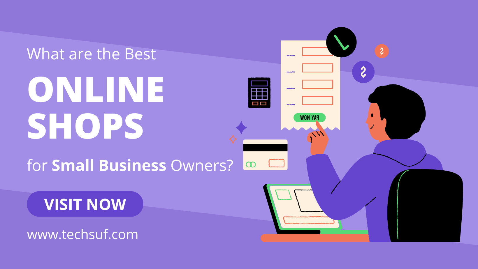
Introduction to Online Shops for Small Business Owners Online presence is essential for small busines...
Sep 26 2024
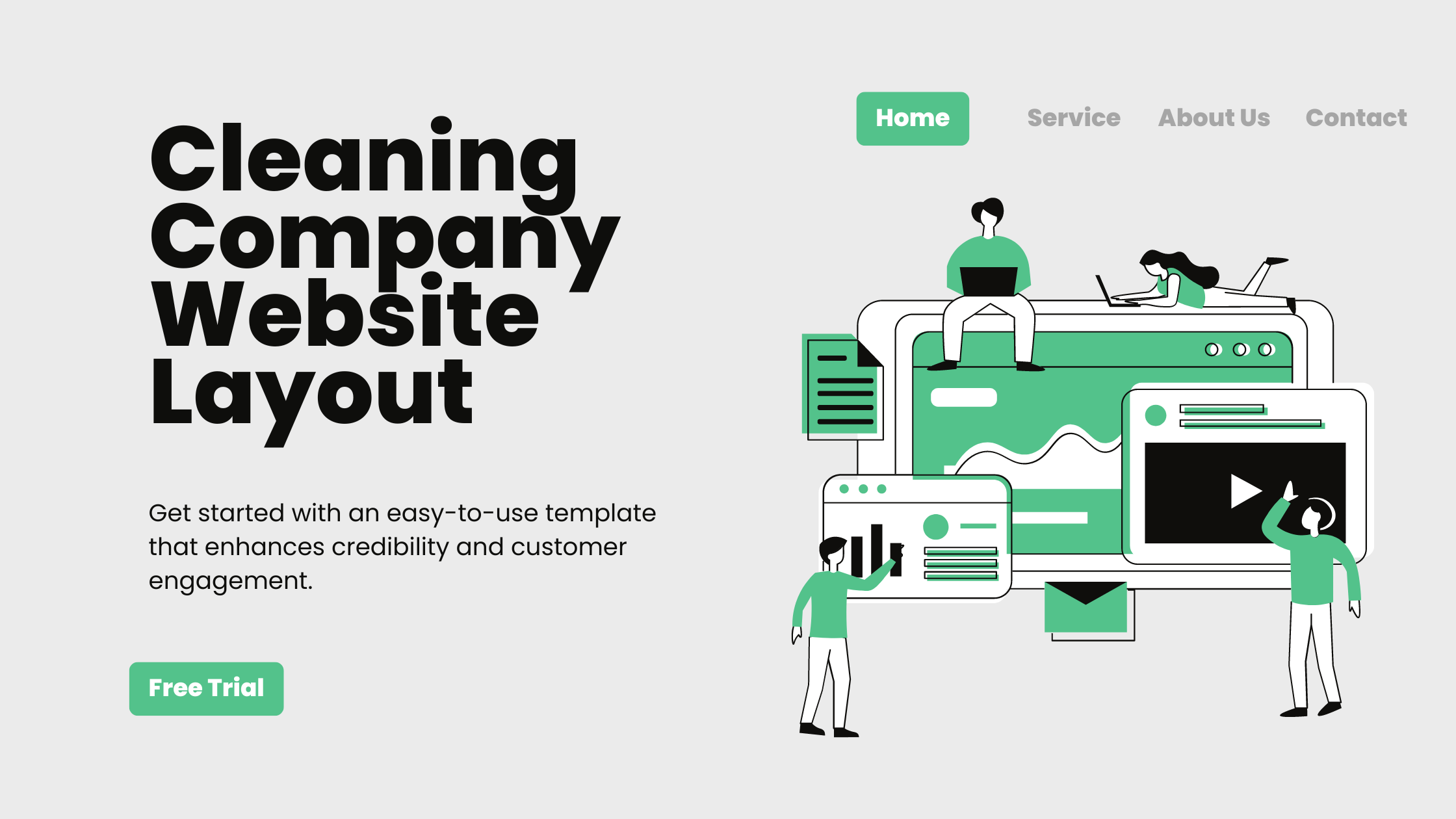
Whether you provide residential cleaning or commercial janitorial services, having a professional websit...
Sep 14 2024

Web design has always been a fast-moving field, and by 2025, the landscape will have evolved dramaticall...
Sep 14 2024

Let us knowhow we can help!
We are happy to help in any way we can. Please let us know what we can do to make your experience with us better. We would love to provide the solutions or resources you need.